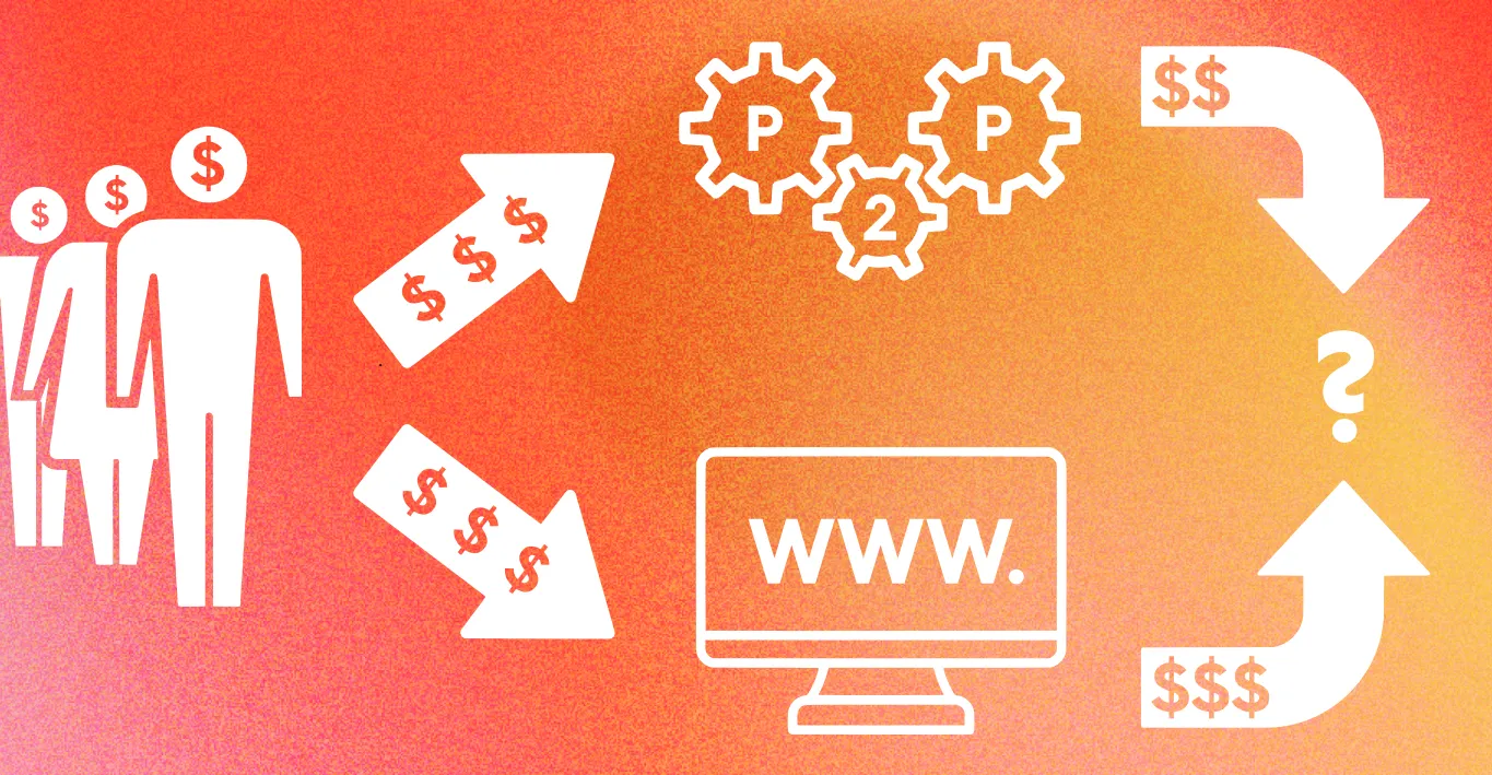
Peer-to-peer donation systems have been a major gamechanger for the philanthropy sector as a whole.
Like ecommerce platforms such as Ebay and Etsy, systems like JustGiving have empowered individuals to take fundraising into their hands on mass. Now anyone who wants to do anything for charity, whether that’s run a marathon, stream a video game, or bake an absurd number of cakes can do so, advertise what they’re doing, and have a functional website for people to donate to.
This is great for individuals, but for organizations are using these same tools is less than ideal.
Consider the following five reasons why, as a rule, actual nonprofits should not be using peer-to-peer donation systems on their central primary website and campaign materials.
After reading all these, you might want to see why Everfund makes more sense.
Amateur associations
If the system you are using just happens to resemble the same system that Greg from Sales Data uses when he does his sponsored kite flying, you have to ask how professional it makes your organization look.
Would Rolex sell all it’s newly made watches exclusively via Ebay?
Would Mercedes use WeBuyAnyCar as its primary dealership?
Would Apple host its professional development blog updates exclusively on Tumblr?
Using services that are widely associated with public, non-professional outfits creates an amateurish association for your non-profit. Something you need to be very careful about avoiding when you want people to trust your nonprofit with their money.
Bungled branding
When using peer-to-peer donation portals or landing pages, your ability to customize is highly limited. Some things will be changeable. Background colours. Suggested ask amounts. Maybe even the text present in the broader schema with some providers.
However what is highly unlikely to be adaptable is the branding.
Your logo may well be present on the page, but it will be joined by the branding of the peer-to-peer provider in question. It doesn’t matter how well they may be suited, or how apt such a design will look. Your brand and the peer-to-peer provider brand will just need to share the space.
This is fine for individuals, since they don’t have a company and a brand to share and deliver. They might just put up a photo of themselves or perhaps some eye catching clip art. But for a professional nonprofit, with employees to support, bills to pay, and a cause to campaign for, it’s very much less than apt to have the cause and the finance collection body getting equal billing.
Curtailed domain
What gets typed into the address bar on a browser when people visit your website is a key area of branding and customization for your nonprofit. It is also an area where peer-to-peer donation providers very often fall short.
With a service like JustGiving and other peer-to-peer providers, you end up with a domain that contains the providers name and a long string of random letters and numbers.
Not exactly personable, memorable, or professional looking.
The option to have your own custom domain on your donation portal and payment landing pages allows you to synchronize every last aspect of the donation experience with your nonprofit’s brand, cause, and campaign. Something peer-to-peer providers more than likely can’t offer.
Security concerns
Because peer-to-peer donation systems are more widely used by a wider body of public individals and private actors, it stands to reason that the overall code-base is more commoly known. This creates the dangerous possibility that it has more vulnerabilities more often than other alternatives.
Even if the system itself is safe, the ubiquity of the format of donation portal, combined with the lack of custom design interface, means that it’s very possible for a less scrupulious person to duplicate a version of your donation portal. Tarnishing your name and stealing your donor’s money in the process.
With a more purpose built and professional donation platform option, such concerns can be put to one side.
Tipping trouble
Some peer-to-peer services have decided to forgo the more transparent and clear option of charging processing fees to keep their operations functional, and instead rely on a ‘voluntary’ tipping process. This sounds more honorable, given that it implies you have the option of not tipping at all, however the £0.00 option for tipping isn’t always easy to reach. It may not be present on the slider button, and you may have to type it in specifically and directly.
This is an example of what we’d call a ‘Dark pattern’. A piece of UI/UX design that’s designed to make the user part with more money than normal for the same service. Such things are bad, but expected for commercial companies, since their entire reason for being is profit motivated. When nonprofits use the same techniques, trust is eroded and positivity connected to the brand gets undermined.
The Everfund alternative
Everfund offer a bespoke, branded, professional service for you and your nonprofit. A donation portal that is not only tailorable with custom domains and specified designs, but one that can be linked to dozens and hundreds of campaigns at once.
Discover more about the advantages of Everfund over the peer-to-peer alternative.

